GitHub Actions gives you the workflow runs view, and that is about it. You can see which runs are green, which are red, and how long they took. But if you are trying to run a healthy CI pipeline across dozens of repositories, that view stops being useful quickly. You need a proper GitHub Actions dashboard, one that tells you not just what happened, but what is slow, what is flaky, what is expensive, and what is getting worse.
This post covers what a GitHub Actions dashboard should actually show, why the native view falls short, and the practical options for building or buying one.
What GitHub Actions gives you out of the box
The native Actions tab in GitHub is fine for a single repository and a handful of workflows. You get:
- A list of recent workflow runs with status and duration.
- Per-job logs, annotations, and test summaries.
- Basic workflow usage data in the Actions usage and billing page, showing minutes consumed per runner type.
That is enough if you have one repo, one workflow, and a team small enough that somebody always notices when something breaks. For everyone else, there are gaps.
Where the native view falls short
Once you scale past one repo, the Actions tab stops answering the questions that actually matter:
- No cross-repo view. Workflow status lives per-repository. You cannot open a single page and see the state of every pipeline in your organisation.
- No trends. You can see that a run took 14 minutes, but not whether that is faster or slower than last week, or whether the p95 duration is creeping up.
- No flakiness signal. A red run is a red run. Actions does not tell you whether a failing job is a known-flaky test, a legitimate regression, or a broken workflow.
- No developer wait time. The Actions usage view shows runner minutes but not the time developers spent waiting for CI to finish, which is usually the bigger cost.
- No DORA metrics. Deployment frequency, change lead time, change fail rate, failed deployment recovery time (MTTR), and deployment rework rate are not surfaced anywhere. You can derive them from the API, but Actions does not calculate them for you.
What a proper GitHub Actions dashboard should track
A dashboard earns its place when it answers questions you cannot answer from the raw workflow runs page. At minimum, that means these six views.
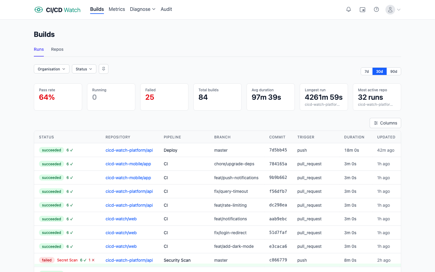
1. A unified pipeline status view
Every workflow run, every repository, in a single list, filterable by branch, status, trigger, and time window. If someone asks “is anything broken?”, one glance should answer it. If you are also running GitLab CI, CircleCI, or other providers alongside Actions, the same view should show those too.
2. Duration trends and performance
Per-workflow median and p95 duration over time. Slow CI is a compounding tax on every PR, and the only way to catch regressions is to watch the trend, not the last run. A good dashboard classifies workflows as fast, slow, or critical based on their duration profile.
3. Stability and flaky test detection
Group your workflows into healthy, flaky, and broken based on failure patterns. A flaky workflow fails intermittently without code changes, which is different from a broken workflow that fails consistently. If you publish JUnit XML test reports from your Actions runs, the dashboard should also surface the specific flaky test cases.
4. Cost: compute and developer wait time
The Actions billing page tells you how many minutes you have used. A proper dashboard tells you what those minutes were spent on: per repo, per workflow, per branch. More importantly, it accounts for developer wait time: when a PR is blocked waiting for a 14-minute workflow, that is engineering time, and it usually costs more than the runner minutes.
5. PR health and queue time
How long do PRs wait for CI before they can merge? How many are blocked by flaky workflows? Pull-request-centric metrics are the bridge between “CI is slow” and “developers are frustrated”.
6. DORA metrics
Deployment frequency, change lead time, change fail rate, failed deployment recovery time (MTTR), and deployment rework rate: the standard measures of software delivery performance, expanded to five in the 2024 DORA Report. If you deploy through Actions, the data is all there; it just needs to be aggregated. If you are new to these, see what are DORA metrics and why should you track them.
What the GitHub Actions API actually gives you (and the gotchas)
Before deciding whether to build a dashboard or buy one, it helps to know what the raw data source looks like. The GitHub Actions REST API exposes the endpoints you need (workflow runs, jobs, artifacts, and billing usage), but making them behave the way a dashboard expects is where the work is.
- Rate limits. A personal access token gets 5,000 requests per hour; a GitHub App installation gets 15,000 per hour per installation. If you are polling every workflow run across 40 repositories you will burn through either budget fast unless you use conditional requests.
- ETag conditional requests. Cache the
ETagheader and send it back asIf-None-Match. A 304 Not Modified response does not count against most rate-limit quotas, so you can poll frequently without exhausting your budget. The API tells you cheaply when nothing changed. - Rerun semantics. When someone reruns a failed workflow, GitHub overwrites the previous conclusion on the same run id rather than creating a new one. Naive ingestion code either double-counts runs (if you track attempts separately without merging) or loses failure history (if you just overwrite). Both hurt flakiness analysis.
- Webhooks beat polling. The
workflow_runandcheck_runevents fire within seconds of a run starting or finishing. A webhook-driven ingest is real-time and cheap; a polling-only ingest trades latency for rate-limit pressure. - Test reports are not parsed. Actions does not expose test-level results through the API. If you want per-test flakiness detection you have to upload JUnit XML as an artifact, download it, and parse it yourself. The artifact API is separate and has its own size and retention considerations.
Build versus buy
Teams that decide they need a dashboard usually start with one of three approaches.
The spreadsheet
Someone on the platform team writes a script that calls the Actions API, dumps runs into a CSV, and produces a weekly summary. It works for a month or two, then breaks the first time somebody adds a new workflow, reruns a failed job, or hits a pagination edge case. The script limps along until the person who wrote it leaves, at which point it quietly stops working and nobody notices for six weeks.
The BI dashboard
You pipe the Actions REST API (or webhook events) into a data warehouse and build Looker or Metabase charts on top. This scales further, but the maintenance burden is real. You own the pagination logic, the rate-limit budgeting, the ETag handling, the rerun deduplication, the job-level joins, and the JUnit parsing. The dashboard becomes a project of its own, usually staffed at half-a-person forever. If any of the points in the API-gotchas section above surprised you, that is the maintenance burden talking.
The managed tool
A purpose-built CI/CD monitoring tool handles the data collection, aggregation, and visualisation so you do not have to. The trade-off is that you are trusting someone else with the work, which for most teams beats owning another internal data pipeline.
What CI/CD Watch gives you
CI/CD Watch, a CI/CD observability platform that monitors pipelines across GitHub Actions, GitLab CI, Bitbucket Pipelines, CircleCI, Azure DevOps, and Jenkins, is built specifically for this problem. Connect your GitHub organisation and within a few minutes you have every view above: unified pipeline status on the Free tier, then (on Team plan and above) duration trends, stability classification, cost tracking, PR health, DORA metrics, and alerts. No manual instrumentation required.
If you just want to track DORA metrics, see the DORA metrics docs. If you are worried about Actions cost specifically, see how cost calculation works.
Try it on your own GitHub Actions
The Free tier covers pipeline monitoring for small teams. Connect a GitHub organisation and you will see every workflow run in one view within minutes. Cost tracking, DORA metrics, stability classification, PR health, alerts, and Slack unlock on Team plan and above.
Key takeaways
- The native GitHub Actions UI answers “did this run pass?” but not “is my CI healthy?”
- A proper dashboard should cover status, performance, stability, cost, PR health, and DORA metrics, not just red/green.
- Rolling your own works up to a point, then the maintenance burden starts to dominate the signal.
- A purpose-built tool gets you out of the plumbing business so you can focus on acting on the data.
CI/CD Watch is built by 3CS Technologies Ltd. It started as an internal tool for tracking pipeline health across a mixed GitHub Actions and Jenkins estate. The same engine now powers the SaaS platform.