A platform engineer inherits a Grafana folder called “CI/CD Monitoring.” It contains 47 panels. Total workflow runs this week. Average duration by repo. Runner minutes consumed. Failure count per branch. Slowest build in the last seven days. The dashboard loads. Nobody opens it. When deploys start sliding two months later, the slowness does not show up in any of the 47 panels.
This is the default outcome of asking “what should we monitor in CI/CD?” The generic answer is a list of things that can be counted. The useful answer is much narrower. Monitor the signals that show whether your feedback loops are closing. Everything else is decoration. This is the same framing CI/CD monitoring is built on, applied one level deeper: which specific signals map to which specific loop.
The better question: which loops must stay closed?
CI/CD is a stack of feedback loops, each with a different cadence and a different failure mode. Four of them are worth watching continuously. Everything else is either a leading indicator for one of these, or a vanity metric.
- The CI loop: commit to green build.
- The deploy loop: commit to production.
- The recovery loop: incident to restored service.
- The economic loop: what the loops above cost to run, in compute and in waiting.
If you are starting from scratch, instrument each loop once before instrumenting any of them twice. A dashboard with one honest signal per loop beats a dashboard with twelve redundant ones.
The CI loop: is the build fast and honest?
Surface signals for the CI loop answer two questions. Is the build fast enough that developers trust it? And is it honest, meaning a green result actually tells you something?
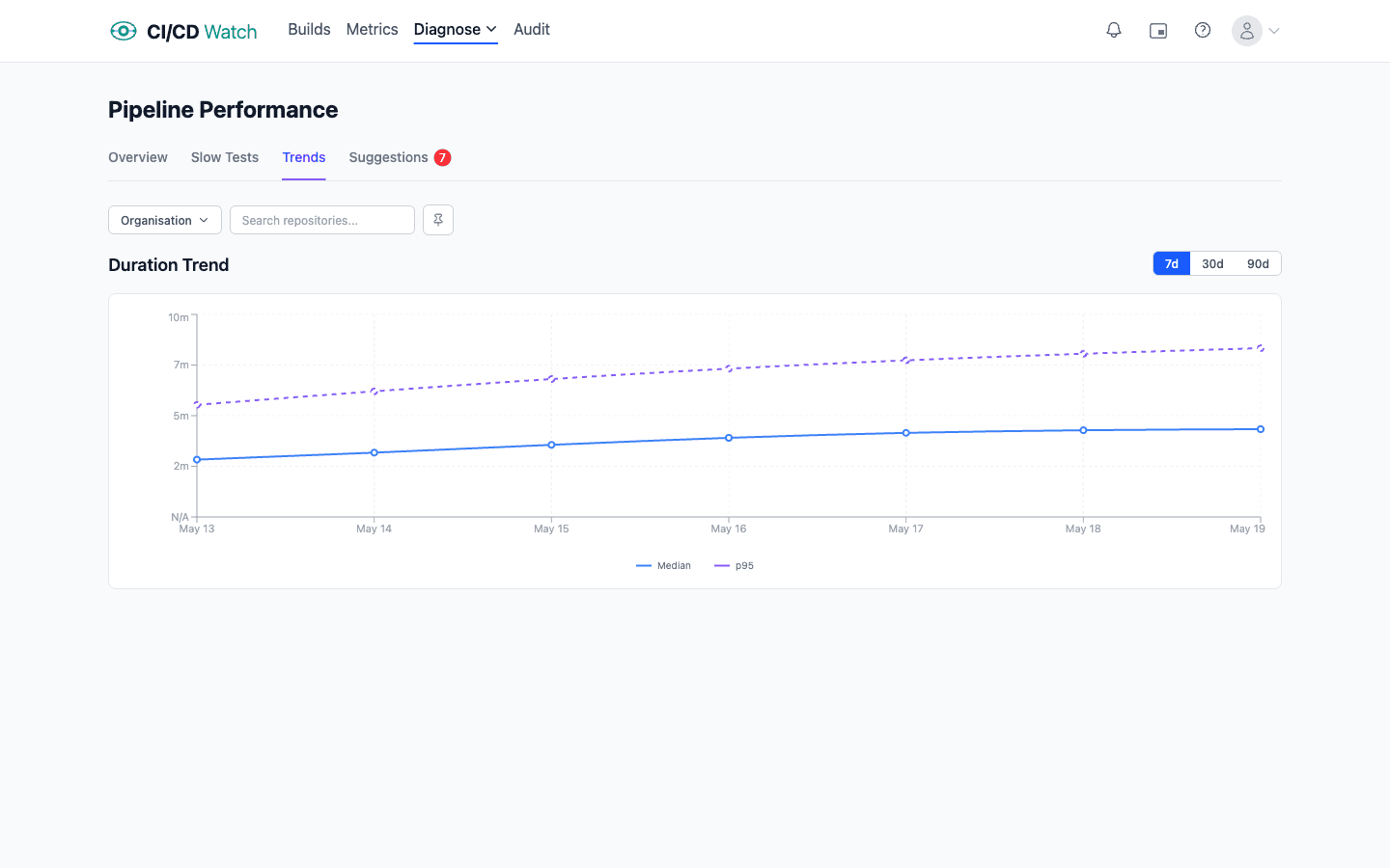
- Workflow duration p95 over a rolling 14 days. The median is reassuring and hides the tail. Developers feel the tail: a workflow that is usually 8 minutes but sometimes 25 is a workflow that everyone routes around.
- Pass rate on first run by workflow. A workflow that is only green on the second attempt is not green, it is flaky.
- Queue time before the workflow starts running. Often invisible in the provider UI and often the biggest component of end-to-end lead time in busy repos.
- Rerun rate. How often the same commit SHA has more than one run attached to it. Across one real workload we looked at, 10.8% of commits carried at least one rerun and the worst case took 12 runs to reach green. Each rerun is a compute charge and a wait cycle the team paid twice for.
When the surface signals say something is off, the drill-down is at test level. Flaky test detection via JUnit parsing (the same XML output most test runners already emit) turns “this workflow is sometimes red” into “this one test passes 87% of the time.” Flip rate (a test's pass-fail-pass pattern over recent runs) is the single most useful signal for quarantining noise. See how flaky tests are detected for the mechanics. Without the test-level drill-down, “CI is slow” is actionable only in theory.
The deploy loop: are changes actually reaching users?
The deploy loop is where DORA research has already done most of the work. The five core metrics are the honest signals for whether continuous delivery is happening:
- Deployment frequency on a rolling window, per service rather than aggregated.
- Change lead time reported as a distribution (p50, p75, p90), not a mean.
- Change fail rate using a stable combined signal (rollback + hotfix-within-window + incident linkage), so the definition does not silently narrow over time.
- Failed deployment recovery time (colloquially, MTTR), reported as a median rather than a mean to stop one long incident dominating the number.
- Deployment rework rate (added to the framework in 2024), the ratio of deploys that are unplanned follow-ups to a production incident. Pairs with change fail rate: a team with low fail rate but high rework rate is recovering noisily, which is still a stability signal.
All five are derivable from pipeline run data joined with Git history and (for fail rate, recovery time, and rework attribution) incident tooling. The measurement guide walks through the decisions that determine whether the numbers are usable.
The recovery loop: how fast does the system heal?
MTTR already lives inside DORA, but the recovery loop has signals of its own that are worth watching independently. Time from first alert to acknowledgement. Time from acknowledgement to resolution. The ratio of incidents linked back to a specific deployment (which feeds change failure rate) against incidents that had no identifiable cause (which usually indicates a gap in your tracing). These are organisational signals as much as technical ones: a team with honest MTTR usually has a healthy on-call culture, and a team with no link from incidents to deploys usually has a weak one.
The economic loop: what is the pipeline actually costing?
The economic loop is the one teams most often under-instrument, because they are looking at the wrong component. Provider bills show compute minutes. Compute is usually the smaller number. The bigger cost, across every team we have data on, is developer wait-time: the salary cost of humans sat waiting for a pipeline to finish before they can move on.
At default rates ($75/hour for a developer, $0.008/minute for a GitHub-hosted Linux runner) wait-time cost dominates compute cost by roughly two orders of magnitude. The ratio is not intuitive because the compute cost is itemised and visible on an invoice, whereas the wait-time cost is distributed silently across the team.
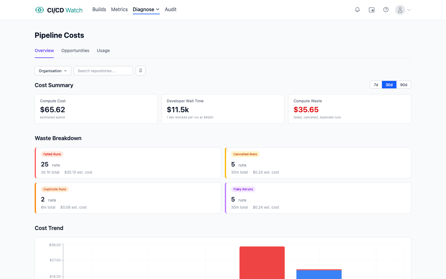
Worth monitoring:
- Compute cost per run with per-runner-type rates (self-hosted, GitHub-hosted Linux, GitHub-hosted macOS, and so on all have different costs).
- Wait-time cost per run using a defensible hourly rate assumption for the team. Even a rough rate reveals the right order of magnitude.
- Rerun-driven cost. Reruns pay both costs twice; tracking them separately makes the flaky-test economic argument concrete.
The cost calculations documentation has the formulae and the assumptions behind them.
What not to monitor
Vanity metrics pad a dashboard without changing any decisions. Total workflow runs this week. Runner minutes consumed in total. Failed build count without context on volume. These are numbers you can count, but they do not tell you whether any loop is closing faster or slower than last week. Aggregate rollups that average across services with wildly different release processes are in the same category: the combined number hides whichever service is degrading.
A good rule: if a signal does not map cleanly to one of the four loops, and you cannot describe the decision you would make when it moves, it belongs on a diagnostic dashboard at best, not on your primary monitoring view.
Thresholds are distributions, not absolutes
“Alert if duration exceeds 15 minutes” looks clean on paper and fires constantly in practice. A single slow run is noise. What matters is whether the distribution is shifting. Track p95 or p99 over a rolling window and alert on the trend, not on the instantaneous value. This is the same framing SRE teams already use for production reliability: the SLI is the signal, the SLO is the target over a window, the SLA is what you promise a customer. CI signals deserve the same treatment. The same applies to stability (flip rate on a test over 50 runs, not a single failure), to lead time (the p90 over 28 days, not one unusual commit), and to queue time (sustained growth, not a spike). A signal that fires on its first bad measurement is usually a signal that gets muted within a week.
How CI/CD Watch groups these signals
CI/CD Watch, a CI/CD observability platform that monitors pipelines across GitHub Actions, GitLab CI, Bitbucket Pipelines, CircleCI, Azure DevOps, and Jenkins, is organised around the four loops rather than the provider UI. Workflow duration, stability, and queue time sit with the CI loop. DORA metrics with the deploy loop. Wait-time and compute cost with the economic loop. The product reads pipeline run data, logs summaries, and test reports from each provider's API (with ETag conditional requests to respect rate limits) and normalises the signals into one view.
The Free tier covers workflow-level monitoring: runs, statuses, duration, branches, across every connected provider. Test-level detail (flaky test detection, per-test flip rate, slowest tests), DORA metrics, wait-time analytics, and alerts are on the Team plan and above. For the product view of stability signals see pipeline stability. For the underlying framing of why pipelines alone are not the thing, see what is CI/CD.
Start with one signal per loop
Connect a provider and the four loops are already populated with default signals. No custom configuration, no dashboard engineering.
CI/CD Watch is built by 3CS Technologies Ltd. It started as an internal tool for tracking pipeline health across a mixed GitHub Actions and Jenkins estate. The same engine now powers the SaaS platform.