A platform team manages forty repositories across GitHub Actions and Jenkins. Builds are passing, roughly. The GitHub Actions tab shows mostly green; the Jenkins dashboard loads slowly but looks fine. Yet somehow deploys keep sliding, on-call gets paged more often than last quarter, and when the VP of engineering asks “are we shipping well?” nobody has a straight answer.
This is what CI/CD monitoring is supposed to fix. But most teams treat it as watching pipelines go green. A run failed, a run succeeded, reruns are automatic. That is enough to tell you whether your last commit broke anything. It is not enough to tell you whether your delivery practices are healthy.
CI/CD monitoring is not about watching pipelines. It is about closing the feedback loop on the engineering practices that determine whether your team ships well. Every practice worth having (trunk-based development, small batches, fast tests, real deployments) exists to shorten a loop. Monitoring is the loop on top of all the others.
Every engineering practice is a feedback loop
Software engineering runs on feedback loops. Each level of work has a different cadence, and each loop's duration compounds into how fast the overall system moves:
- IDE type checker: sub-second
- Local unit tests: seconds to a minute
- CI on commit: minutes to tens of minutes
- Code review: hours to days
- Deployment to staging: minutes to hours
- Deployment to production: hours to days (or minutes, if you are good)
- Customer feedback or production metrics: days to weeks
- Business impact measurement: weeks to months
Each loop at each level either confirms you are on the right track or forces a correction. The shorter the loop, the cheaper the correction. Don Reinertsen, in The Principles of Product Development Flow, argues that the cost of delay on engineering decisions is usually the dominant factor in product development economics, and long loops are the main driver of delay. Nicole Forsgren, Jez Humble, and Gene Kim reach the same conclusion by a different route in Accelerate and the DORA research programme: the teams that measurably outperform are the ones with fast, reliable feedback at every level.
The CI/CD pipeline sits in the middle of this stack. A slow pipeline drags the commit loop (developers wait). A flaky pipeline adds rework to the review loop. An unreliable deployment pipeline extends the production loop. Delays compound forward: every loop downstream is waiting for the one above it to complete.
Monitoring is the meta-loop
Monitoring is a feedback loop about the other feedback loops. If the commit-to-production path is your team's primary work, monitoring tells you how healthy that path is. Without it, you are running blind. The pipeline can look green week after week while still degrading underneath: slower every week, flakier than last month, costing more for the same throughput. Each is a loop eroding beneath the surface, and the only way to catch them is to measure them.
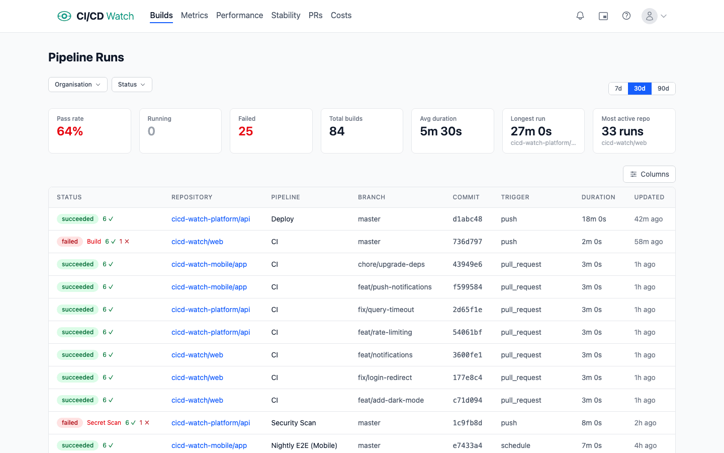
This is where the distinction between watching pipelines and monitoring practicesmatters. The GitHub Actions tab is a pipeline-status view: each run is an event, and the latest green or red is the signal. That is useful, it is the inner loop. But it does not tell you whether the loop itself is healthy, because a loop's health is a property of the distribution of its runs over time, not the last one.
Monitoring and observability are not the same thing. Observability is the ability to ask arbitrary questions after the fact; monitoring is the set of questions you have decided you will keep asking. For CI/CD, the starting point is monitoring: there is a small, well-known set of loop-health questions worth tracking continuously.
What practice health looks like in signals
Put the feedback-loop lens over the standard CI/CD signals and each one maps onto a loop's cycle time or reliability.
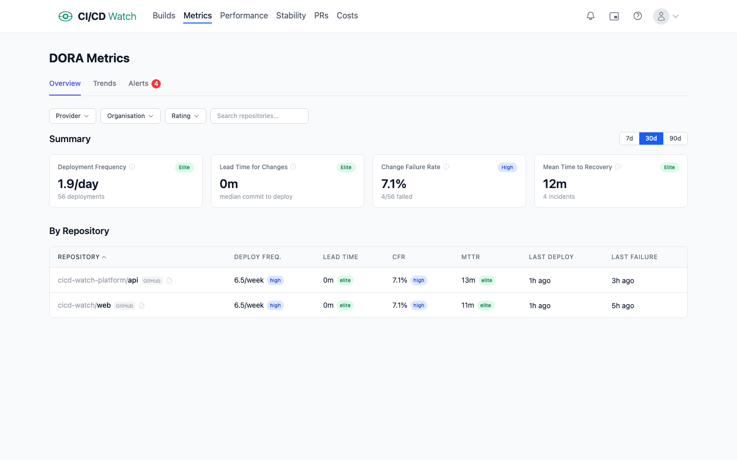
DORA metrics: the four loop-health indicators for deployment
Deployment frequency is the cycle time of the deploy loop. High frequency means small, frequent releases: tight loop. Low frequency means batched releases that shift risk forward. Elite teams deploy multiple times per day, meaning the deploy loop completes every few hours. Low performers deploy monthly; their deploy loop is a month long, and every problem the loop would catch is detected a month late.
Lead time for changesis the full commit-to-production loop's duration. Fast lead times come from small batches, fast tests, and reliable deployment automation: every stage of the loop trimmed. When lead time grows, it is usually because one stage is slowing, reviews are queuing, CI is degrading, or a manual approval step has crept in.
Change failure rateis the quality feedback on the loop. If the loop is running fast but producing broken deployments, you are shipping bugs faster. The practice of “small, reversible changes” is not working. A healthy loop has CFR under 5%; above 15%, you are in territory where smaller batches or better pre-deploy testing would pay for themselves.
Mean time to recovery is the recovery loop. Fast recovery means your team can roll back or roll forward quickly, which only happens if deployments are easy and frequent. Long recovery indicates the opposite: deploys are rare events that take effort, and rolling one back takes more effort. In practice the recovery loop and the deploy loop are the same loop. If deploys are cheap, recovery is cheap.
For the full definitions and the measurement traps behind each metric, see our guide to DORA metrics and the practical measurement guide.
Beyond DORA: the signals that describe pipeline loop health
Duration trendsreveal whether your CI loop itself is degrading. A test suite that ran in six minutes a quarter ago and takes eleven minutes today has added five minutes of drag to every commit, every developer, every day. The signal that matters is p95 workflow duration week over week, not the last run's time.
Pipeline stability, the healthy / flaky / broken classification, tells you whether the loop is reliable. A loop that fails 20% of the time for non-deterministic reasons is not really a feedback loop; it is a coin flip wrapped in YAML. Flaky tests in particular destroy the value of the loop because they train the team to ignore failures. See our notes on how pipeline stability is classified.
Cost captures both what the loop costs to run (compute charges on the provider's rate card) and what it costs to wait (developer time lost to queues, sequential stages, and reruns). In our experience the latter usually exceeds the former by roughly two orders of magnitude at default rates ($75/hr for developer time, $0.008/min for a GitHub-hosted runner), which means a slow pipeline is a cost signal long before the invoice shows it.

How cost is computed matters: if you only count runner minutes you will miss where most of the waste actually lives.
PR health, cycle time, review lag, and reopen rate, measures the review loop, which is the bottleneck for most teams once CI itself is fast. See how PR health is tracked.
Together these signals describe the health of a team's delivery practices in a way that a row of green checkmarks cannot.
Why provider-native UIs stop scaling
Every major CI/CD provider ships a dashboard. GitHub Actions has the workflow runs view. GitLab has the pipelines page. Jenkins has the classic build history view (or Blue Ocean). CircleCI, Azure DevOps, and Bitbucket Pipelines each have their own. These views are optimised for the inner loop: did my last run pass? They do that well. They fall short past a certain team size for three reasons.
- They are event views, not health views. The list shows runs in descending time order; it does not aggregate, trend, or classify. Finding out that your p95 build duration has drifted upward over eight weeks requires writing a query. The dashboard will not tell you.
- They are single-provider. If your estate mixes GitHub Actions and Jenkins, you have two dashboards, neither of which shows cross-provider trends. Teams running two providers or more are increasingly common (often inherited through mergers, or kept in parallel through partial migrations), and no provider-native UI addresses it.
- They do not model practices.“Healthy”, “flaky”, “broken”, “degrading”: none of these are first-class concepts in provider-native dashboards. You can infer them from the raw events, but that inference has to be done somewhere.
The honest description of the gap: provider-native UIs are great if you have one repo, one provider, and you only care about the latest run. Most teams stop fitting that profile within a year.
Build or buy
At the point provider-native views stop working, teams have two realistic paths: build a dashboard on top of the provider APIs, or buy one.
Buildingis a genuine option and worth respecting. The GitHub Actions REST API, GitLab CI API, and Jenkins' API all expose workflow run data. Wire them into a BI tool (Looker, Metabase, Grafana) or a bespoke app, and a small team can produce something useful within a few weeks. For organisations that already have a data engineering function, this is sometimes the right call. The data is yours, the queries are adjustable, and no external vendor sits in the critical path for engineering visibility.
The hidden cost is maintenance. Provider APIs change (GitHub in particular iterates fast). Rate limits bite when you pull in bulk, which is why conditional requests with ETags are the correct implementation shape. Webhook integrations need reliability engineering of their own. New providers arrive (the team adopts CircleCI, or inherits a Bitbucket estate through an acquisition) and the dashboard needs extending. The same is true for new signal types: you wired duration trends, now you want flaky-test classification, now cost per run, now PR cycle time. What starts as a weekend project tends to become a full-time half-role within eighteen months. That is fine if monitoring is a problem you want to own strategically. It is not fine otherwise.
Buyingmakes sense if you would rather the monitoring-of-your-monitoring be someone else's problem. You are trading API-level control for operational leverage. The build-versus-buy decision almost always turns on the team's existing shape: data engineering teams tend to build, platform teams and engineering leadership tend to buy. Neither is wrong; both are honest responses to the same constraint.
Where CI/CD Watch fits
CI/CD Watch, a CI/CD observability platform that monitors pipelines across GitHub Actions, GitLab CI, Bitbucket Pipelines, CircleCI, Azure DevOps, and Jenkins, was built for this exact gap. Connect a provider and within minutes you see every workflow run across every repo in one dashboard, on the Free tier. On Team plans and above the same data drives DORA metrics, stability classification, cost tracking, PR health, and alerts.
The design principle is the one this post argues for: monitoring should surface practice health, not just run status. Every signal the platform exposes maps onto one of the feedback loops above: duration trends for the commit loop, DORA for the deploy loop, stability for the reliability of any loop, cost for the drag on all of them.
Teams that connect it typically spend the first few days replacing some internal Grafana board or Google Sheet they had been keeping alive by hand, then spend the weeks after that noticing loops that had been widening quietly. On one real workload we measured a rerun rate of 10.8%: roughly one commit in ten was really two, paying twice for compute and waiting twice for feedback, with one outlier that eventually took twelve runs to go green. The same workload showed wait-time cost dominating compute cost by almost two orders of magnitude — a loop that looked cheap on the provider invoice was expensive every time someone sat watching it. Those are the findings that justify the meta-loop.
For implementation detail, see:
- How CI/CD Watch calculates DORA metrics
- How cost is computed, including developer wait time
- How pipelines are classified as healthy, flaky, or broken
- How deployments are detected per-team
Start closing the loop
CI/CD Watch's Free tier covers pipeline monitoring for small teams. Connect a provider and see every workflow run across every repo in one dashboard. Start for free, no credit card required.
CI/CD Watch is built by 3CS Technologies Ltd. It started as an internal tool for tracking pipeline health across a mixed GitHub Actions and Jenkins estate. The same engine now powers the SaaS platform.